Getting the Hang of Web Typography
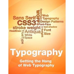
The implications of desktop publishing, where anybody who has access to a computer can set type, have led to a flood of poorly designed brochures, flyers and web pages. In web design especially illegible text, incorrect use of punctuation marks and inappropriate font combinations or use of line widths are frequent. The new techniques that web fonts offer — much hailed by some and dreaded by others — might bring about even worse examples of ugly and illegible web typography.
In order to avoid this, we have dedicated this e-book to web workers that are dealing with typography in their daily lives, but have no special training for this independent craft. Getting the Hang of Web Typography is a collection of Smashing Magazine’s best and most recent articles on web typography with one additional article series and glossary. You can use this e-book as reference work and inspiration.
It’s a valuable book read that helps you to create rich, sophisticated Web sites with beautiful and elegant Web typography.
Table of Contents
- The Ails Of Typographic Anti-Aliasing
- 10 Principles For Readable Web Typograph
- 5 Principles and Ideas of Setting Type on the Web
- Lessons From Swiss Style Graphic Design
- 8 Simple Ways to Improve Typography in Your Designs
- Typographic Design Patterns and Best Practices
- The Typography Dress Code: Principles of Choosing and Using Typefaces
- Best Practices of Combining Typefaces
- Guide to CSS Font Stacks: Techniques and Resources
- New Typographic Possibilities with CSS 3
- Good Old @Font-Face Rule Revisited
- The Current Web Font Formats
- Review of Popular Web Font Embedding Services
- How to Embed Web Fonts from your Server
- Web Typography: Work-arounds, Tips and Tricks
- 10 Useful Typography Tools
- Glossary
Book Details
- Paperback: 257 pages
- Publisher: Smashing Media GmbH (January 2011)
- Language: English






Is there ePub version ?