The Icon Handbook
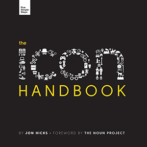
Have you ever needed to create an icon for something and not known where to start? How do you go about crafting the right message, the tone, the line work and getting it to work in the environment it’s supposed to; be it mobile, operating system, or browser. Thankfully we now have the place to go.
Jon Hicks’ ‘The Icon Handbook’ will become the go-to book for the modern designer; for uncovering the thought processes, the skills and the reference for designing your own icons.
This book is aimed at designers who already have basic vector and bitmap drawing skills. It could be that you want to create a simple, unique favicon, or perhaps you’ve been asked to work on a mobile app that requires them. It starts at the basics and takes you right the way through to being able to create stunning iconography.
Topics include:
Chapter 1: A Potted History of Icons
Let’s start the journey from the very beginning and look at the development of a symbolic language to complement our written one, how previous works have influenced modern icon design, and how the meaning of icons has evolved from religious art to encompass software. As part of the journey, I’ll also delve into how I became involved with designing icons as early as 1984.
Chapter 2: How we use icons
Icons are more than just decoration or pretty pictures. They serve a wide range of purposes, from overcoming language barriers and describing functions, to conveying mood and emotion. This chapter looks at the various uses of icons, but also covers an equally important aspect — when not to use them.
Chapter 3: Favicons
Now we’ll start building up our icon skills, beginning with favicons. Even if you’ve never created any other types of icons before, I’m willing to bet that everyone reading this has at some point made a favicon. For the majority of you, it’s probably a regular task. They’re an ideal place to start, as we can look at ways of achieving pixel-crisp artwork and clarity at small sizes — skills that we’ll build on in later chapters.
Chapter 4: The Metaphor
The heart of an icon is the metaphor it uses, the functionality implied by the visual representation. This chapter starts as all projects do, with a client brief. We’ll pick up this brief and run with it, working through the process of discovering if icon conventions already exist, and how to create them if they don’t.
Chapter 5: Drawing Icons
At this point in the book, we’ve been through the initial process of reading the brief, checking for existing conventions, and deciding on the right metaphor to use. We’ve also created some simple favicons — now let’s move on to creating some proper icons! In this chapter we’ll look at the drawing process, then in chapter 6 we’ll consider the final file format and deployment method for the icon which can have a bearing on how we create the artwork. We’ll start with simple pictograms and then move on to small colour icons. We’ve already covered some basics of drawing to crisp pixels in chapter 3 about favicons. This chapter will build further on that, introducing the concepts of balance and consistency.
Chapter 6: Icon formats and deployment
There are a number of different formats of, and methods for, deploying icons, and while PNG is undeniably the most common, there are others with their own particular pros and cons that are useful if the context is right. We’ve briefly touched on this in chapter 3 with regards to favicons, but now we’ll look at all the other contexts. The format we choose can also have some bearing on the creation of the artwork, so it’s worth considering this before getting started. As well as covering the pros and cons of each format, and how it affects the artwork, we’ll also look at the variety of techniques for displaying icons on the web.
Chapter 7: Application Icons
We’ve developed our icon skills throughout this book, thinking about how we use icons and where they came from, then looking at designing simple favicons. We followed this up by tackling metaphors, pictograms and small colour icons. In this chapter, we’ll round off the book by exploring in detail the most complex and independent icon form: application icons.
Appendix (Common icon badges, Drawing and creation tools, Icon reference chart)
We’ve developed our icon skills throughout this book, thinking about how we use icons and where they came from, then looking at designing simple favicons. We followed this up by tackling metaphors, pictograms and small colour icons. In this chapter, we’ll round off the book by exploring in detail the most complex and independent icon form: application icons.
Book Details
- Paperback: 323 pages
- Publisher: Five Simple Steps LLP (December 2011)
- Language: English
- ISBN-13: 978-1907828041
