Responsive Web Design
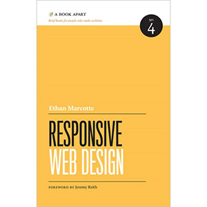
From mobile browsers to netbooks and tablets, users are visiting your sites from an increasing array of devices and browsers. Are your designs ready? Learn how to think beyond the desktop and craft beautiful designs that anticipate and respond to your users’ needs. Ethan Marcotte will explore CSS techniques and design principles, including fluid grids, flexible images, and media queries, demonstrating how you can deliver a quality experience to your users no matter how large (or small) their display.
Table of Contents
Chapter 1. Our Responsive Web
Chapter 2. The Flexible Grid
Chapter 3. Flexible Images
Chapter 4. Media Queries
Chapter 5. Becoming Responsive
About the Author
Ethan Marcotte is a web designer & developer who cares deeply about beautiful design, elegant code, and the intersection of the two. Over the years, Ethan has enjoyed working with such clients as the Sundance Film Festival, Stanford University, New York Magazine, and The Today Show. He swears profusely on Twitter, and would like to be an unstoppable robot ninja when he grows up. Beep.
Book Details
- Paperback: 143 pages
- Publisher: A Book Apart (2011)
- Language: English
- ISBN-10: 098444257X
- ISBN-13: 978-0984442577
